WAR, wRC, SPD…all are common sabermetric stats. What do they all mean? How much insight do such stats provide over and above standard metrics? This short blog presents a series of visualizations to help explore answers to the foregoing questions. All charts use 2018 data from FanGraphs.
WAR vs OBP
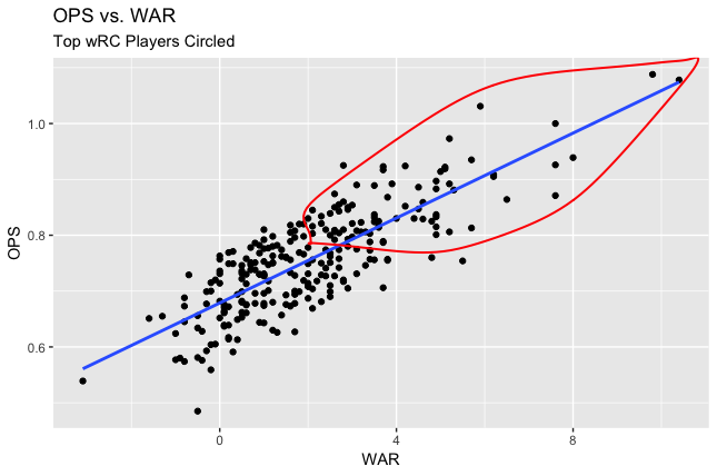
WAR is an exceedingly common metric in advanced baseball statistics; it’s an acronym for wins above replacement. WAR supplies an all-encompassing metric for how many wins a player is worth above a standard replacement (think of a AAA player). The details are pretty nitty-gritty, as WAR is an omnibus statistic that combines a wide array of metrics. The scatter plot below displays WAR vs OPS. For those unfamiliar, OPS is slugging percentage plus on base percentage. It is perhaps the best “standard” metric for capturing the effectiveness of a hitter.
For an additional layer of analysis, I’ve circled the players with the highest wRC, which stands for weighted runs created. It’s an extension of Run Created, which, well, quantifies how many runs a player created for his team. The “w” part adjusts for ballpark and era.
In the visualization below, we see a strong linear relationship between OPS and WAR. The players with the highest wRC values also have the best OPS and WAR. That being said, a number of players deviate from the simple regression line drawn through the graph. OPS does not perfectly predict WAR. The latter statistic provides nuance, though OPS still supplies a fairly instructive picture.

Layering on wOBA
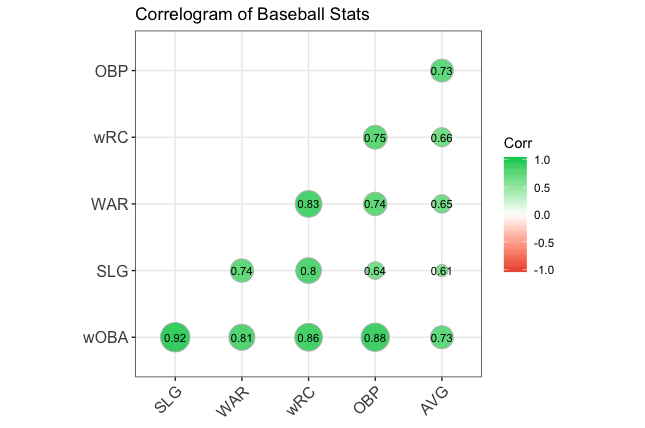
Thus far, we have inspected WAR and wRC. Another prevalent advanced statistic is wOBA, which extends OBP by weighting how players reached base. The visualization below displays correlations among three advanced statistics and two standard ones. What’s most interesting is how batting average, the quintessential statistic, is not too strong of a predictor of WAR and wRC. By contrast, wOBA is captured fairly well by other statistics.

Win Probability Added
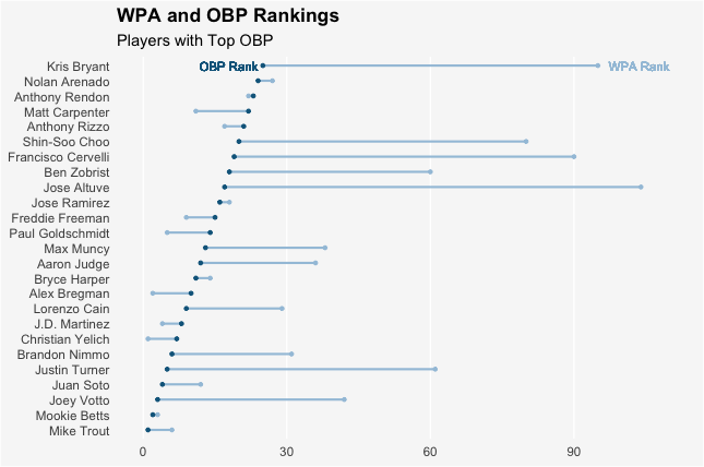
One of my personal favorite statistics is Win Probability Added, WPA. It’s a cumulative measure of how much plate appearances swayed a team’s Win Expectancy. Intuitively, we might expect WPA to be fairly strongly related to something like OBP. The visualization reveals this is not necessarily the case. The dark blue dot represents a player’s OBP rank, the light blue dot the player’s WPA rank. In a number of cases, they are quite far removed.

A Final Metric: sPD
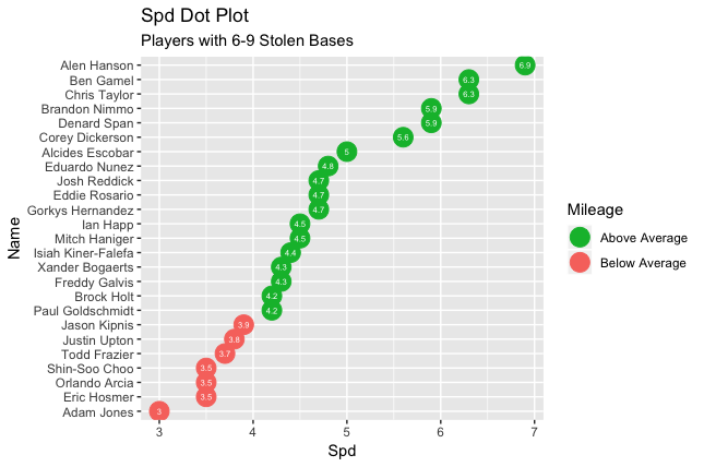
sPD measure how speedy a player is, factoring in items like stolen base percentage, stolen base attempts, triples, and runs scored. the sPD values for players with many stolen bases tend to be high. We see intriguing findings for players who have between 6-9 steals, though (this represented a decent-sized population that could be analyzed). Only judging on number of steals, we wouldn’t necessarily deem any of these players to be fast. However, some are quite quick – sPD scores above 5.5 are above average. By contrast, we see some players who are slow, even though they have a comparable number of steals.

In sum, the common sabermetric stats we explored certainly provide useful insight and nuance. That being said, they are not a panacea. They may not tell a completely different story than common statistics, in most cases, but they do convey a more comprehensive narrative overall.