As documented previously on this blog, I am a pretty big Royals fan. The month of July was, then, pretty exciting for me as the team surged into playoff contention. Earlier in the season, I wrote a piece about the Royals’ struggling offensive. Since the team has drastically improved since that time, I wanted to write a follow-up piece that tests a few hypotheses about their improvement.
This is intended to be a short post, mostly focusing on data viz.
Did the Royals strikeout-to-walk ratio improve over time? Well, no. It has actually increased. There goes that theory. Each bar represents a successive game.
Now, what about outbursts of home runs? Click refresh on your browser window to play the animation of home run totals by game. Anecdotally, we see some big spikes later in the season.
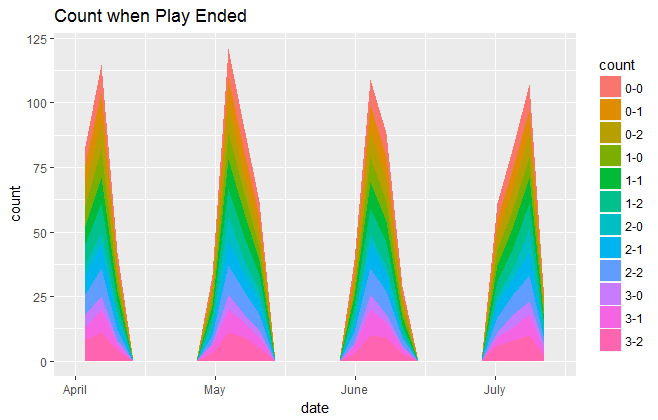
OK, I cheated on this next visualization and made it with ggplot in R instead of d3 like the others. Are the Royals hitting earlier or later in the count? According to this visualization, there doesn’t seem to be much difference.

Conclusion
Some of the hypotheses panned out…and some clearly didn’t. One of the things I love about data viz is its ability to quickly confirm (and necessitate the need to prove mathematically) or refute a hypothesis.